On 14th November Live Webinar with Aleksei Protopopov!
Register Now
Online Shopping Accessibility Index_s Online Shopping Accessibility Index_s

Tips & Guides — 15 Mar 2022

Online Shopping Accessibility Index

Online Shopping Accessibility Index

Have you ever been browsing the internet and thought to yourself, how hard would it be to navigate this site if I was visually impaired, suffered with hearing loss, or had neurological or cognitive limitations? 

As astonishing as it might seem in 2022 – and particularly after events of the past two years have left so many reliant on internet access and online shopping –  a huge number of online retailers still refuse to take into account the fact that many individuals have a wide range of disabilities that can make online shopping an extremely difficult and overwhelming task. 

With a 2019 online survey highlighting that 71% of disabled people with access needs ‘click away’ from any website with barriers, we have researched the accessibility of some of the most popular online retailers across a section of different industries and global countries. 

Using Google’s Chrome DevTools and Lighthouse, we were able to determine the user experiences of some of the world’s top online conglomerates, extracted through site performance and accessibility reports.

From fashion retailers like Chanel and H&M, right through to automotive companies like Volvo and Renault, the research allowed us to delve into some of the most valuable brands online, to discover whether the best interests of all customers are really at the heart of operations. 

It has been determined that the average UK ‘click away’ cost equated to £17.1 billion ($23 billion) in 2019, so it is more crucial than ever to determine where these brands are going wrong and offer methods of improving the user-friendliness of their websites, and ultimately improve their online sales and profits. 

There is an astronomical amount of money to be made through online shopping, which was showcased as eCommerce sales in the US skyrocketed to 4.28 trillion US dollars in 2020. So, where exactly are these brands going wrong?

Ranking the accessibility of the world's most valuable brands

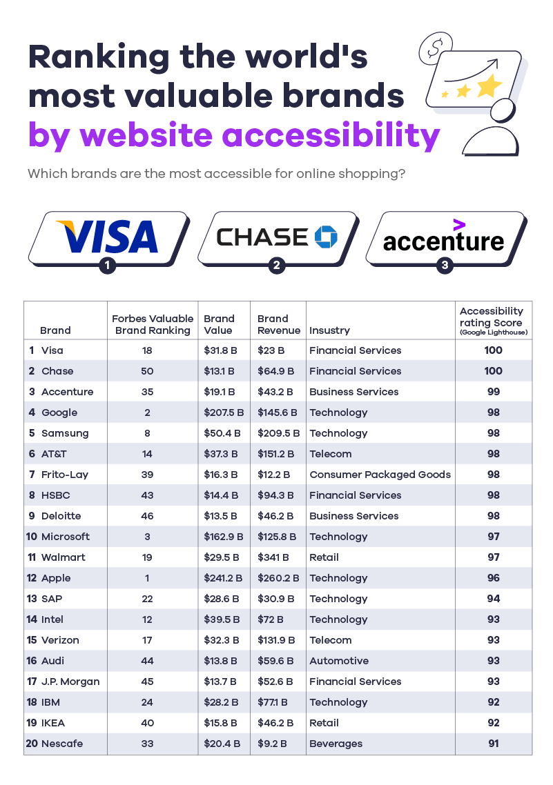
Ranking the world's most valuable brands by website accessibility

When it comes to some of the wealthiest brands in the world, there are very few excuses for websites lacking accessibility. Unlike with smaller, less lucrative companies, the money to prioritise and maintain site accessibility is not an issue, leaving many with disabilities or impairments to wonder how something so important can continually be overlooked. 

Utilising ‘Google Lighthouse’, a tool which takes into account factors that compromise a site’s accessibility such as unhelpful alt text, irrelevant page titles, and brands using colour to convey their messages, we were able to see which brands came out on top regarding their appeal to as wide a range of web users as possible.

First up, we have financial service provider Visa, scoring an admirable 100 in the convenience rankings. This includes only one web accessibility error and 13 web alerts, highlighting that a great deal of time would have been spent on making things suitable for customers with disabilities. 

Second on the list is Chase Bank, also scoring 100, with one accessibility error and two contrast errors. Business service provider Accenture scored a respectable 99, with only one accessibility error, but 15 contrast errors. The contrast errors on the website likely lowered the score for Accenture as the low contrast between the text and the background colours make it difficult for users with low vision to see the page properly. 

Interestingly, aside from Google, which scored 98 on Lighthouse, the top four most valuable brands on the Forbes 2020 ‘Most Valuable Brands’ seed list failed to make it into the top five most accessible sites in our research. 

Apple, worth a gargantuan $241.2 billion, along with Microsoft, Amazon and Facebook were all found to have elements of their main websites that would cause accessibility issues for disabled or impaired internet users. With more than one in three relevant individuals with access needs stating they would ‘click away’ from a site with accessibility barriers, it is surprising to see such wealthy companies failing to meet their needs.

Top brands per industry for online shopping accessibility

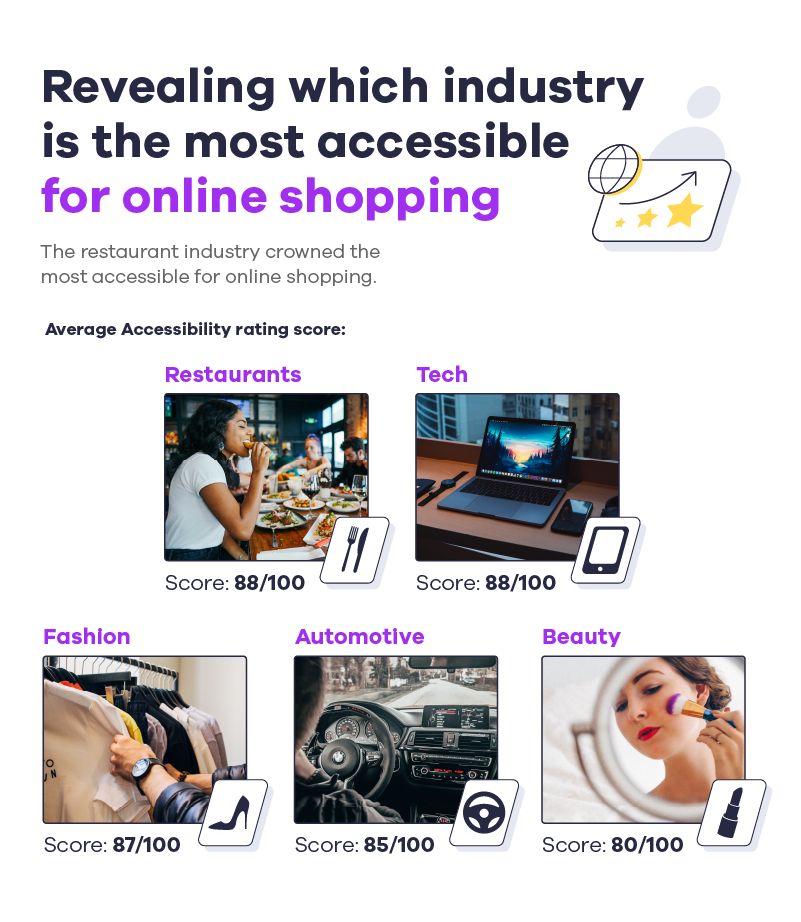
Revealing which industry is the most accessible for online shopping

Are some industries simply more accessible when it comes to their online offering than others? After analysing our findings, it became apparent that different industries have taken more online shopping accessibility measures than others when it comes to online shopping. 

These reports take into account factors such as accessibility errors, along with contrast errors and accessibility alerts. 

  • For example, are the online menus or instructions laid out clearly enough for everyone to read and follow on a restaurant or tutorial website? 
  • Are there too many colour hues on the page that could make things inaccessible for those suffering with colour blindness? 
  • Are there an abundance of graphics on a page that would prove too distracting for visually impaired people? 
  • Does the site feature an extensive landing page that could prove difficult for people with mobility issues that struggle to use mice or trackpads. 

So many aspects need to be considered, but are so often overlooked. 

Renault and Volvo are the most accessible automotive brands in the world

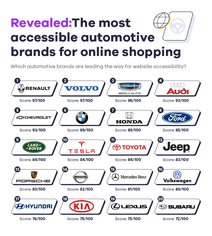
Revealed the most accessible automotive brands for online shopping

At the top of the automotive industry were Renault and Volvo, both scoring 97. However, Renault was seen to have 120 accessibility alerts, while Volvo only had 34. Despite scoring the same score, Renault website features more alerts than Volvo overall, perhaps due to the website’s small text which makes the site difficult to read, particularly for those with low vision.

A redeeming feature for Renault is the website’s black and white colour-scheme making it ideal for colourblind individuals. 

Every word is laid out in contrasting white block capitals, while Volvo’s efforts also included a minimal colour palette and clear text. Third up was Geely, securing a score of 96, despite research indicating 96 accessibility errors. 

At the bottom of the automotive list sat Subaru, with a less-than-impressive accessibility score of 72. With 75 accessibility errors, along with 26 contrast errors and 54 alerts, there are clearly some improvements to be made in order to make the website more convenient and user-friendly to all.

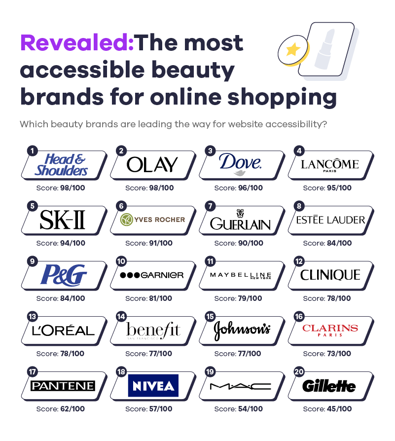
Head & Shoulders crowned the most accessible hair & beauty brand for online shopping

When it came to the beauty industry, anti-dandruff hair brand Head & Shoulders emerged the most accessible, with a score of 98. With zero accessibility errors on the entire site, and just 15 other problems flagged, the haircare powerhouse is clearly a force to be reckoned with when it comes to user-friendliness. 

Second on the list was Olay, also scoring 98. Impressively, the beauty brand also had zero accessibility errors on site, alongside 33 detected issues, highlighting the time and effort taken to make its online presence as convenient as possible for disabled people. 

Skincare giants Dove scored a respectable 96, placing them third on the list of the most accessible beauty brands. At the bottom of the list was Gillette, with a score of just 45, suggesting that there are definitely changes to be made to the website.

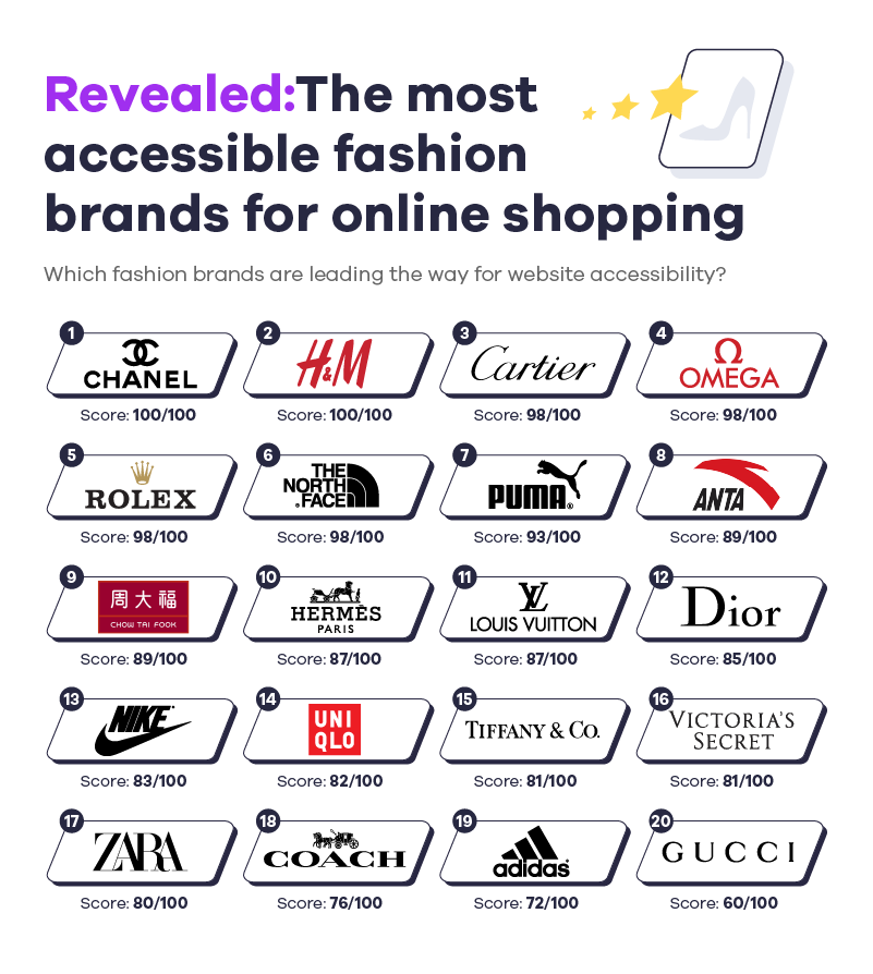
Chanel and H&M are leading the way for accessible fashion websites

The top of the list for fashion was Chanel, with an awe-inspiring score of 100. This also takes into account six accessibility errors and 15 alerts, placing the luxury brand firmly in the lead as a shining example of how a clothing website should lay out its site for the benefit of all online shoppers. 

Next up was H&M, also with top marks of 100. 43 overall errors showcased the company’s attention to detail when it came to online accessibility, which is instantly obvious thanks to its clean, minimalistic colour-scheme. 

Trailing behind is Gucci, with a less than desirable score of 60. What is immediately recognisable is the brand’s reliance on colour to convey their message, as the busy, garish site would no doubt make things incredibly difficult for colourblind people to read. 

Another discernible factor is that of the text being extremely small, with no obvious options or instructions on how to enlarge it for people with visual impairment issues.

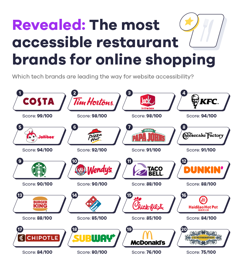
Costa revealed as the most accessible restaurant website

For anybody with access needs looking to research the menu of a restaurant or foodservice establishment prior to a visit, a clear and easy to follow website is a must-have. First up, scoring almost full marks with 99 and just 18 errors flagged, is beloved coffee shop chain Costa. 

Next up is Canadian multinational fast food restaurant chain Tim Hortons, scoring a very respectable 98. Despite some messages being conveyed through colour, such as vegan options in green, the website is very simplistic and easy to navigate. 

In third, we have American fast-food restaurant Jack in the Box, which also scored 98 on Lighthouse. However, with only 19 accessibility errors flagged, this company will not have to make drastic changes to become as accessible as possible. 

Finally, in last place, we have pub and restaurant chain Wetherspoons, with a score of 75. 64 highlighted errors were found in our research, certainly surprising considering the huge popularity of the chain among UK consumers. 

Elements of the Wetherspoons website that could be considered for improvement involve enhancing the alt text on included images, simplifying the colour-scheme, and improving the contrast of the site, for people with colour-contrast sensitivity. 

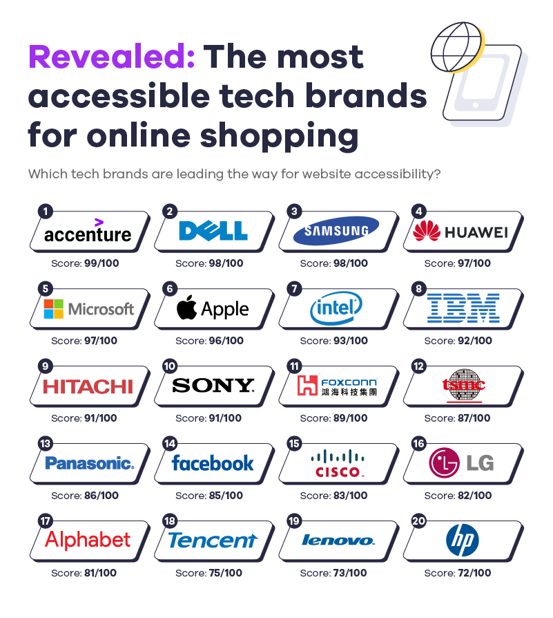
Accenture tops the list as the most accessible tech website

Revealed the most accessible tech brands for online shopping

Finally, we can reveal the rankings for the most user-friendly tech websites. Reigning supreme in first place is Accenture, with a score of 99. With just 52 errors flagged overall, the site does not have far to go when it comes to being as convenient and as accessible as possible. 

Scoring 98 and following closely behind in second place are computer giants Dell Technologies. Just 17 accessibility errors make it unsurprising that this company scored so highly, but the user-friendliness of the website speaks for itself: muted colour-scheme, large bold font and easily-accessible helplines at the ready for people to seek assistance. 

In third place, we have Samsung, also scoring 98. With a fairly high error ranking of 148, it is easy to see why the company did not achieve full marks. However, an overall decent user experience has allowed Samsung to remain in the top three. 

HP are in last place with a score of 72, with the site instantly conveying colour-contrast issues, which would make navigation difficult for visitors with colour-contrast sensitivity. Bright, garish colours against a white background are guaranteed to offer a nightmare experience for people living with colour blindness, while lots of extremely small writing would be frustrating for people with visual impairment.

The importance of website accessibility - what do brands need to be aware of?

When it comes to starting a new business, it is crucial not to leave any of your potential customers feeling alienated by your website and online presence. With around 30 million colour blind people across Europe and around 300 million people in the world with colour vision deficiency, it is important to keep colour-schemes minimal, as relying on different hues to portray different messages or themes can lead to a very bad user experience. Adding effective alt text to images is another way to be inclusive towards people with colour blindness, while also offering the opportunity to improve the optimisation of your website. 

As well as colour, contrast needs to be taken into consideration. There are millions of people that suffer from an extreme sensitivity to colour contrast all over the world, including conditions such as glaucoma, diabetic retinopathy and retinitis pigmentosa. This could mean that, if your website design features a bright white background and garish red font with bright yellow images, somebody sensitive to colour contrasts would have to click away. 

For people that have general vision impairment, it can be very useful to include the option to enlarge the font on a website, in order to make navigation to different pages a smoother experience. Similarly, if there is a lot of text on the page in general, such as long paragraphs, it could be a sign that your content is not SEO-optimised and could make navigation difficult for people with learning difficulties such as dyslexia. Always ensure that content is short and snappy, making it easier to avoid the need to make the font smaller.

One of the most important aspects of an accessible website is being able to navigate the entire thing by the keyboard alone. Many people suffer from mobility issues such as arthritis, which would make using a trackpad on a laptop or a mouse uncomfortable or even impossible. Being able to move from one page to another using the keyboard would remove the need for excessive hand movement. 

Another thing to remember is that lots of visually impaired people use screen readers to browse the internet. This allows people to hear what is on the screen instead of relying on reading it, making it all the more important to maintain a concise tone of voice. Finally, as tempting as it can be to utilise automatic media on your page, this could be potentially shocking for people using software to navigate your website. For example, if somebody was using a screen reader, an automatic video could clash with content being read out. In extreme cases, it could scare people with sensitivity to sound or nervous tendencies, such as anxiety. 

Overall, with so many different techniques to make your online presence as inclusive as it possibly can be, there are very few excuses in 2022 for brands, especially extremely valuable ones, to be missing the mark so regularly.

Methodology and data sources:

Taking the top websites and companies globally the team at affise have accessed which brands are leading the way with online accessibility. 

Country’s Top eCommerce Sites:

Taking 15 of the top 20 countries for most online users, we used similarweb to find which eCommerce sites are most popular in each country

Source: similarweb

2022 Projected eCommerce Revenue:

Taking the top 20 countries for most online users, we found who is projected to generate the most revenue in the eCommerce market

Source: Statista

Top Global Companies:

Taking the top 50 most valuable brands, we used Google Lighthouse to tell us which company has the best website accessibility

*Home Depot and Marlboro were removed to due access restrictions

Source: Forbes | Google Lighthouse | Wave

Top Industry Accessibility:

Using five sectors including Automotive, Beauty, Fashion, Tech and Restaurants, we took 20 of the top brands from each sector and used Google Lighthouse to rate the accessibility to tell us the industries putting accessibility first.

Source: Brand Finance | Fortune | Google Lighthouse | Wave

*Websites were accessed via desktop

This article is reffered with:

Share this article
Affise Academy

Written by

Affise Academy

Affise is a partner marketing platform for brands, advertisers and agencies to scale via all possible performance marketing channels. Synergy of technology and our long standing experience lets you expand your partnerships, automate every step of the campaign lifecycle and make data-driven decisions.

See all articles →

Sign up to receive our newsletter

Stay on top of the competition. Let us keep you updated with news, insights, and more

email envelope
This site is registered on wpml.org as a development site. Switch to a production site key to remove this banner.